Japan’s defeat of South Africa during the 2015 Rugby World Cup was so memorable that they’ve made a film about it. A proper one. For cinemas and everything. It’s widely acknowledged as “one of the greatest shocks in the history of the tournament”, but just how big a shock was it? Could it have been anticipated? And what are the chances of it happening again if the two sides meet in the knockout stages of the 2019 tournament?
In my last post I made the case that the World Rugby Rankings represent a useful (if imperfect) proxy for the relative strength of any two teams, and can be used to contextualise performances. With a small amount of manipulation, we can begin to understand the likelihood of Japan’s victory, and by extending this approach we can assess likely outcomes of future matches, and even entire tournaments.
As per my previous post, I took the results from the four previous World Cups, plotted the points differences from each match against the corresponding difference in world ranking points, and then plotted a trend line through the data. I’ve used a curved line because it fits the data better than a straight line, and because it is pragmatically sensible: tightly ranked teams tend to result in close matches, while large ranking differences tend to mean someone’s in for a hiding.
Data from all RWC matches, 2003 – 2015.
Difference in ranking points = Difference in ranking points between the two teams in a given match.
Points difference = Highest ranked team’s score – Lower ranked team’s score in a given match.Trend line: Predicted Points Difference = (0.034 * [Difference in Ranking Points]^2) +(1.74 *[Difference in Ranking Points] ).
The trend line represents the points difference we would expect in a match between two teams given their relative difference in ranking points. The data above this line represent matches where the higher-ranked team performed better than expected. Conversely, the data below the line illustrate where the higher-ranked team performed less well than expected. Finally, the data below the horizontal axis represent upsets, where the lower ranked team won.
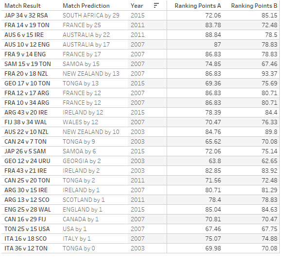
At the start of the 2015 RWC, South Africa had 13.09 more ranking points than Japan of (85.15 – 72.06). Reading off our trend line, we would therefore have expected the Springboks to beat Japan by about 29 points. If we take all of the World Cup upsets since 2003 and compare them similarly, this is indeed the largest scale of upset.
Those of you of a morbid disposition might like to hunt down your own personal heartbreak from the table below, where I’ve listed all of the upsets ranked from biggest to smallest.
Sides coached by Eddie Jones have posted notable victories in three of the matches in this list.
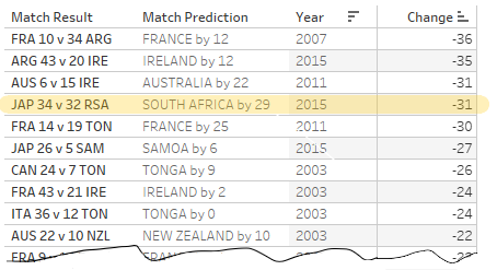
A more instructive approach is to assess the prediction error of each match, comparing the actual match points difference with what was predicted. If we sort our table by this metric, Japan v South Africa (2015) is actually only the fourth most remarkable reversal since 2003, behind France v Argentina (2011, Bronze medal match), Argentina v Ireland (2015, QF) and Ireland v Australia (2011, Pool stage).
Japan vs South Africa in 2015 is only the fourth biggest upset since 2003, in terms of difference between predicted and actual scoreline.
What were the chances of that happening?
[Authors note: From here on in, I’m going into more methodological detail than I normally would. I’m aware that this won’t be of interest to everyone but I want to be clear about where the numbers in other posts come from. I think transparency is important in prediction, and want people to know what method I’ve employed when they’re interpreting any predictions I make. Budding analysts might find the approach useful in their development, and equally readers might well share superior approaches].
If we look at the differences between our match predictions and actual points differences for all matches, not just the upsets, we start to do some pretty cool stuff. And by “cool” I mean of course “deeply uncool to most people, but potentially interesting to some.”
Plotting all of these prediction errors in a histogram (below), we can see that the data is more or less normally distributed around zero (which means there’s not a systematic bias in the model – this is good), and has a certain amount of spread. This is our prediction uncertainty. I’ve used the same colour coding as before – all results with a negative prediction error represent where the higher ranked team performs less well than expected. In some cases (but not all) this results in an upset.
Differences between predicted score-lines and actual score-lines from RWC 2003-2015.
If we design a population of random numbers such that it replicates the characteristics of this data set, we can create a data-set of likely outcomes for future matches. All we do here is take numbers from our artificial population (mean = 0, SD = 17), and add it to our points difference predicted by our trend line for that match up. Repeating this process many times for a match, we get a realistic distribution of possible match results around our predicted score-line.
The proportion of predicted wins and losses for each team in a match will then vary according to this distribution shape and the distance of its mid-point from zero. We can calculate the chance of victory for either side by simply counting all the occurrences either side of zero, and divided those numbers by the number of iterations. For reference, I used 1,000,000 iterations (below that my results weren’t that repeatable from run to run).
Applying this approach to Japan v South Africa (RWC 2015), we get a distribution of possible results around a likely scoreline of South Africa by 29. Approximately 5% of simulated results differences have negative points differences, in other words, giving Japan a 5% (or 1 in 20) chance of victory. While this is definitely heavily weighted in South Africa’s favour, it’s considerably better than the “this is never going to happen” chance I was still giving Japan at half-time.
Distribution of match simulation results.
Prediction Time
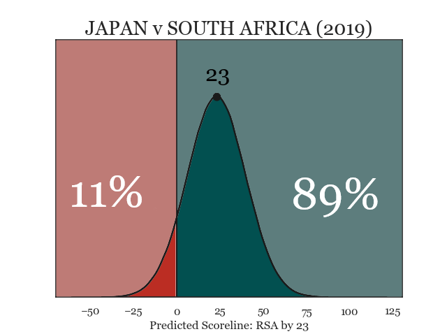
We can, of course, use exactly the same method for prediction. If Japan were to meet South Africa in a re-run of this game, in the quarter finals of the 2019 RWC (which is not that fantastical a proposition), today’s World Rugby ranking points give Japan an improved chance of staging an upset. Comparing the two visualisations, we can see that South Africa’s most likely winning margin has reduced from 29 to 23, but also the distribution has shifted in favour of Japan. This means, a higher proportion of simulated matches result in a Japanese victory (11%), and the chance of an upset (assuming this match were played) has improved from a 20-1 shot, to about 9-1.
Simulation results for Japan v South Africa, if they were to meet in the 2019 Rugby World Cup.
Now, none of this accounts for Japan’s (presumed) home advantage, nor does it factor in the Bokke being far less likely to underestimate the Brave Blossoms a second time around. What it does mean though, is that the gap between the two nations has narrowed considerably since that memorable day in Brighton.
Anyway, this is all very good, and hopefully of interest to some. Lots of people expand it to construct simulations of entire tournaments, using the fixture list and draw to run tens or hundreds of thousands of iterations of the tournament. Adding up the outcome stats gives the relative likelihood of various outcomes (champion, semi-finalist, pool winner, etc). While this is entertaining, for me the power is in its provision of a base-line from which we can explore other effects.
A note of caution
To round this out I want to highlight the inherent assumptions in my approach, and what that means for interpreting the results.
That the underlying model accurately represents each competitor nation. We have previously established that the rankings provide a reasonably representative generic model of outcome v relative team strength, with a certain level of variance. However, France have a reputation for being unpredictable. Meanwhile Argentina might reasonably claim the consistent over-performers. If these and other team specific effects are present, they are not factored into this approach, and the predictions are weaker for it.
That home advantage isn’t a factor. Is it a benefit? Is it a disadvantage? Likely different for any given team. Either way, it isn’t accounted for here. Maybe one to explore further in another post.
That what happened before predicts what happens next. The data set we have used here is at a minimum four years old. A quarter of the data-set is sixteen years old. In that time, squads, players, coaches and even the lawsthemselves have changed, many times over. It is entirely possible that we’ve developed a model on a set of data that no longer reflects the nature of the game.
What this all means (and this applies for interpreting any data) is: while you shouldn’t accept my results as fact, you might find them a useful input to put alongside your own knowledge, and knowing their limitations will make you better able to do so.
I haven’t tested it yet, but it is for sure something that we can test with this approach. Hoping to look at that, and a few other things over the course of the competition. But yeah, you can definitely examine team specific differences to the generic “all teams” model. That’s one of the nice things about this approach – just gives you a nice baseline for comparison.


So do we see things like France’s “reputation for being unpredictable” pop out of the model?
LikeLike
I haven’t tested it yet, but it is for sure something that we can test with this approach. Hoping to look at that, and a few other things over the course of the competition. But yeah, you can definitely examine team specific differences to the generic “all teams” model. That’s one of the nice things about this approach – just gives you a nice baseline for comparison.
LikeLike